
Refugees and Asylum Seekers by Origin - Map
Initially, our group was uncertain about the angle we wanted to look at migration patterns from. We were certain that we wanted it to involve the emergency migrations of refugees and asylum seekers. We began our process by examining data published by Our World in Data that was sourced from the United Nations.
After cleaning the data and ensuring its accuracy by checking the U.N. source, we began plugging the data into Tableau. We were certain that we wanted to pursue a map visualization.

Upon our initial visualization, we found it easy to notice the significant numbers of emergency migrations from the Middle East.
We narrowed down the data to include information from 2016 to 2020. We checked with the data set and confirmed this for accuracy.
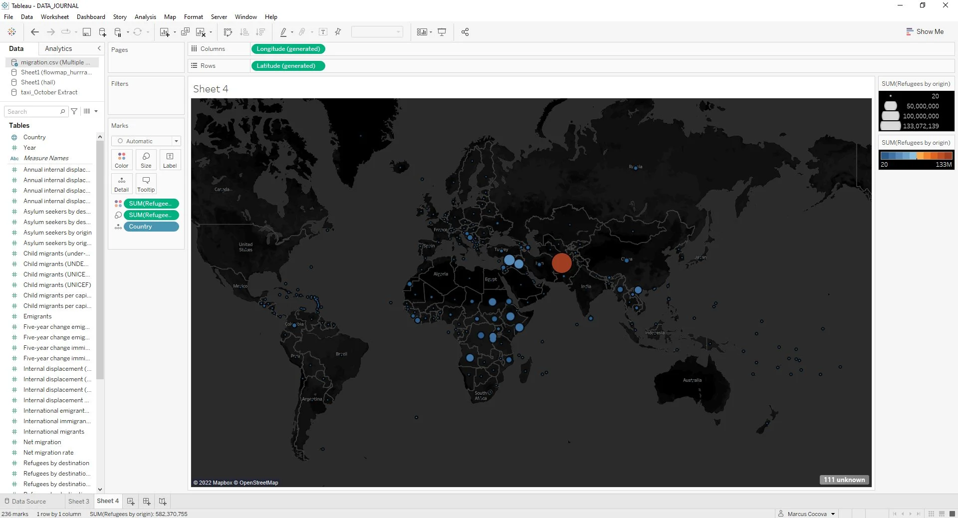
We tried to adjust the gradient of color across the different bubbles. For some reason, adjusting from steps to a gradient did not increase the degree of color variance. This is because of the vast scale of values between each region. The background was then darkened to make the colors more prominent.
Our design was fairly mundane, but clearly illustrated the point of our investigation. We wanted to make sure that the pop-out information graphic included all the necessary information about each region.
We aspired to illustrate migration patterns. It would appear that more data is required to illustrate this through Tableau. The mapping aspect of our project then shifted from migration patterns to causality for these large numbers of Middle Eastern migrants. For this reason, the destinations have been explained in a later visualization.

Instead, we created viewable fields of the year and region for our map. This interactivity makes it so the viewer can explore every point of origin across every year that data was collected. The map is set to begin displaying all regions in the year 2015 because of the causation of the Arab Spring with regard to Middle Eastern emergency migrations.

The colors were shifted to the more eye-catching gradient between red and gold for the number of refugees because every asylum seeker is a refugee, making this the most prominent value in our data set. The size was then assigned to the number of asylum seekers.
The Arab Spring and ISIS - Historical Research
The most significant piece of contextualization for the large number of migrants from the Middle East is the relationship between the Arab Spring and the uprising of ISIS. Given that both of these issues stand up several decades of history, it seemed best to begin with the Arab Spring, since our data started us in that direction.
Many of the gaps in our knowledge were filled by information from History’s website and Vox.
This information smoothly transitioned to Bynad Sharef’s personal story because his family fled from Iraq when ISIS rose to power.
Bynad Sharef - The Human Element
It is important to keep in mind that we are not simply talking about numbers, but people. We interviewed Bynad Sharef to reinforce the human element of the story we are covering. Despite some of Sharef’s experiences, like his father working with the United States making him an outlier, most of his experiences are similar to those of other Middle Eastern refugees.
Sharef’s experiences are directly related to the Arab Spring and ISIS. We decided it was appropriate to place his sections after the explanation of how the Arab Spring and ISIS relate. It also seemed appropriate to reinforce that refugees often do not want to leave their home countries and are forced to leave. We supported this notion by concluding with Sharef’s desire to return to Iraq.
The Arab Spring, ISIS, and Sharef - Timeline
Amid an article as long as ours it can be easy to lose sight of how the topics covered are related. It seemed best to provide the reader with a timeline of events to have the relationship between these events illustrate themselves more clearly. We added the sections manually into a Google Form.

We used StorylineJS and Google Forms to create a timeline of the events discussed in the article. The best-fitting spot for this visualization was between the explanation of the Arab Spring and ISIS and Sharef’s story.

Destinations of Refugees During Arab Spring - Map
After completing a data query from UNHCR’s website, which pulled refugee population data from the Middle East and North Africa, there were several formatting steps that had to take place before visualization. This is also why the data was narrowed down to just this region, as the entire world refugee population data was too vast.

First, after linking the data to tableau, a union had to be created with a copy of the data in order to create calculated fields for: route order, route identification, route, and route location. These were all necessary to setting up the process of creating a makeline.

After the union, a separate excel sheet had to be created to supplement coordinates of the countries, as the original dataset from UNHCR did not provide them. This new excel had to be linked through an “inner” relationship in which the countries and their coordinates had to be linked to the “route location” calculated field. This also helped to set up separate coordinate elements for origin countries and asylum countries.

The process of visualization began with adding both route id and route order to “details.” This showed every path available from the data. From there, a filter was added for country of origin to better visualize, and to create the first aspect of interactivity to the map.

Then, the axis was duplicated to add a layer to show the sum of refugees per asylum country. The refugee numbers were added to “size” and format changed to circle.

Merging the two maps to a dual axis ended with a spidermap with sized circles at destination points showing population. The last step of the process, besides coloring, was adding a sliding filter for the years 2010-2021.

2020 Refugee Data
We got part of our data from the World Bank. Our goal was to find the most recent data on Middle Eastern refugees. After Google searching, we found data from 2020, which is the most recent year available.


The World Bank’s data link was not downloading, so we had to manually create an Excel document of the data.

After creating an Excel document, we exported our data to Tableau. First, we created a simple bar chart. To make the data visualization more interactive, we created a slider by adding the Middle Eastern countries dimension to filters and then averaging the amount of refugees. After an interactive chart was created, the dashboard was made.

The data visualization was published on Tableau Public.
Impacts on Refugees - Research
While becoming a refugee is tragic, it is important to contextualize the greater implications of this tragedy. The most apparent were the physical and psychological tolls taken on those displaced by conflicts of war.
We found studies published by Sage Journals and Plos One that provided evidence to support the notion that many refugees leave their countries of origin with persisting disorders both physically and mentally.
This seemed to be a good segue into our conclusion because many of the programs set up to address these issues face the difficulty of language barriers, cultural barriers, and underfunding.
MARCUS:
I created the “Refugees and Asylum Seekers by Origin” map. I conducted research on the Arab Spring and ISIS, interviewed Bynad Sharef, and created our timeline. I researched the impacts on refugees. I formatted our presentation. Additionally, I wrote the sections on the total number of refugees, the Arab Spring, the rise of ISIS, Sharef, and the impact on refugees. I was also responsible for the corresponding parts of the presentation which reflected my writing and visualizations.
MINA:
I created the “Refugee Population by Country or Territory 2020” dashboard. My dashboard includes an interactive bar chart with a slider that shows where Middle Eastern refugees were coming from in 2020, the most recent year available. I was also responsible for researching the legal definitions of refugee, asylum seeker, and stateless people. In addition, I wrote a section about the resettlement process.
I also conducted two interviews. I interviewed Fred Mbuga, the director of resettlement at the Refugee and Immigrant Assistance Center (RIAC) in Boston, Massachusetts. Mbuga provided information about the resettlement process, life at refugee camps, mental health complications among refugees, and his organization's resettlement data. I also interviewed Willemine van de Wiel, a doctor from the Netherlands who has worked at refugee camps. She provided information about her experience working at refugee camps, particularly, Moria, Europe’s largest refugee camp, which burned down. Van de Wiel also confirmed the poor living conditions at refugee camps and the mental health and medical complications refugees are most likely to experience. I was also responsible for creating my slides for the presentation on the Middle Eastern refugee crisis.
JOHN:
I created the “Destinations of Refugees During Arab Spring” spider map, and did the findings from that visualization, connecting the causation of large refugee population countries like Syria and Iraq to host countries like Jordan and Lebanon. I was also responsible for slides pertaining to this data visualization and the findings.